
Python challenge 1 - Can computers be used to create art?
This is of course a challenging question, as art has different meanings in different contexts. Whatever your thoughts on that question, there is no doubt that computers can be used to create shapes and figures that can change a mood or feeling when viewed.
Can a computer create art?
This first challenge looks at creating pictures using the numpy and matplotlib packages, which will be used throughout this series.
One particular way of creating interesting geometric shapes is by using parametric equations. These are a particular way of describing a curve using a ‘parameter’, t. For example, one way of plotting a circle is by using the equations
x = cos(t)
y = sin(t)
Values of x and y are found at a range of values of t, and then a computer plots lines between the pairs of points that are found.
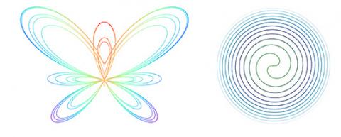
In this challenge you create the pictures shown below by plotting parametric equations. As well as the circle, we will also plot a Butterfly Curve (left) and Fermat Spiral (right).
Target:
Write one page of Python that will:
- Plot a circle, using the parametric equation above.
- Find the parametric equation for Fermat’s Spiral (online), and therefore plot the spiral.
- Do the same for the Butterfly Curve.
Extensions:
- Specify and plot 5 circles with different sizes and different colours.
- For the Butterfly Curve, change the script so that the colour of each line segment changes with the x-coordinate.
- For Fermat’s spiral, plot the curve so that the colour gets lighter with the radius of each line segment.
Packages:
All challenges will use numpy and matplotlib, and these are the only two packages required to make the figures shown above. Once your code is working, the colormap and ListCollection modules may be useful for speeding up code or changing the colour of figures.
Try to get as far as you can on your own before viewing the hints or the solution
-
Hints for Python Challenge 1
- If you are having difficulties plotting a circle, try plotting a simple function first and build up to more complex functions. For example, maybe try plotting the straight line y = 2x + 1 first, or the quadratic y = x2 − 1.
- When you are plotting the circle, the parameter t needs to be chosen. Usually this is chosen as an array. Such an array can be set up using the numpy.linspace command.
The equation describing Fermat’s Spiral is given by
y = ±t0.5 sin(t)
x = ±t0.5 cos(t)(where ± means that one part of the spiral uses + and one uses −). Can you work out how to plot the curve using just one plot command?
- The equation describing the Butterfly Curve includes the exponential function. This function is coded within numpy as numpy.exp. Also, the number π can be obtained using numpy.pi.
Notes
In the figures plotted above, a number of Colormaps have been used to vary the colour of the line segments as a function of position. Different maps have different purposes - some are smoothly graded from light to dark, while others only appear as discrete colours.
- If you are having difficulties plotting a circle, try plotting a simple function first and build up to more complex functions. For example, maybe try plotting the straight line y = 2x + 1 first, or the quadratic y = x2 − 1.
-
Solution for Python Challenge 1
# ===== Challenge 1: Can a computer create Art?

import matplotlib.pyplot as plt
import numpy as np

# 1. Plot a circle.
# Linearly space t between 0 and 2*pi for a full circle
t = np.linspace(0, 2*np.pi)
x = np.cos(t)
y = np.sin(t)
plt.plot(x,y)
# Make the aspect ratio equal so it appears 'true'
plt.gca().set_aspect('equal')
plt.show()

# 2. Plot Fermat's Spiral, as in https://en.wikipedia.org/wiki/Fermat%27s_spiral
# Change the length to change the number of times the curve spirals
length = 40
t = np.linspace(0, length, 10000)
x0 = (t**0.5) * np.cos(t)
y0 = (t**0.5) * np.sin(t)
x1 = (-t**0.5) * np.cos(t)
y1 = (-t**0.5) * np.sin(t)
# Stick the two vectors together
x = np.concatenate((x0[::-1], x1))
y = np.concatenate((y0[::-1], y1))
plt.plot(x,y)
plt.gca().set_aspect('equal')
plt.show()

# 3. Plot the Butterfly Curve
# The curve is specified from 0 to 12*pi
t = np.linspace(0, 12 * np.pi, 10000)
x = np.sin(t) * ( np.exp(np.cos(t)) - 2 * np.cos(4*t) - (np.sin(t/12))**5 )
y = np.cos(t) * ( np.exp(np.cos(t)) - 2 * np.cos(4*t) - (np.sin(t/12))**5 )
plt.plot(x,y)
plt.gca().set_aspect('equal')
plt.show()

# Extension: using colormaps on the butterfly curve (and LineCollection for faster plotting)
from matplotlib import cm
from matplotlib.collections import LineCollection

# Find the radius, then normalise
r = np.sqrt(x**2 + y**2)
r = r/max(r)

fig, ax = plt.subplots()
segments = []
for i in range(len(x)-1):
    segments.append([(x[i], y[i]),(x[i+1], y[i+1])])

coll = LineCollection(segments, cmap=cm.rainbow, linewidth=0.8)
coll.set_array(r)
ax.add_collection(coll)
ax.set_aspect('equal')
ax.autoscale_view()
ax.axis('off')
plt.show()
Ready for the next challenge?
Click here to explore 'How computers recognise songs'